The task
TWI wanted to develop a dedicated website to support the delivery of around 100 technical courses in over 30 countries across the world. Two core audiences would use this site: professional individuals and companies.
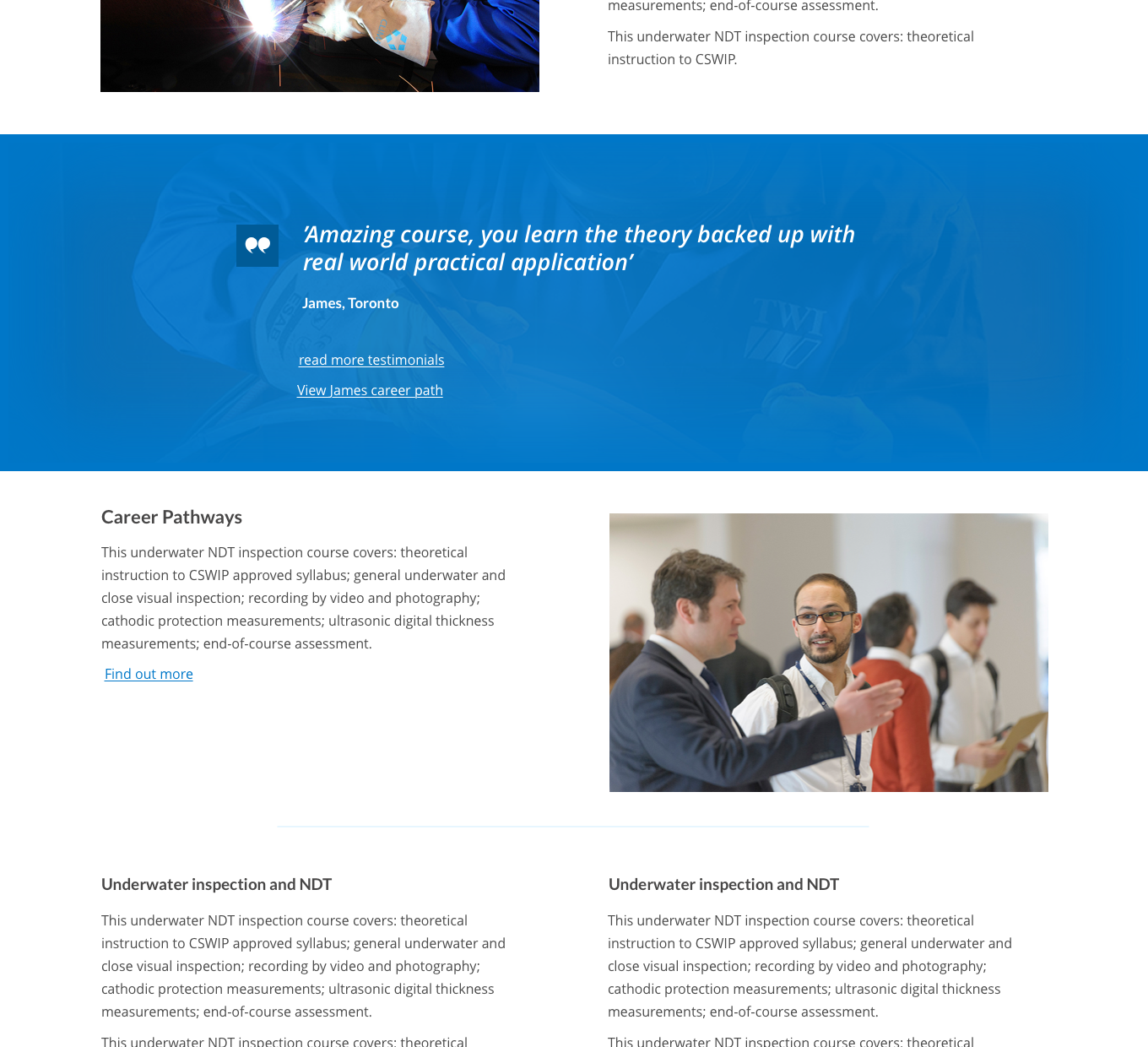
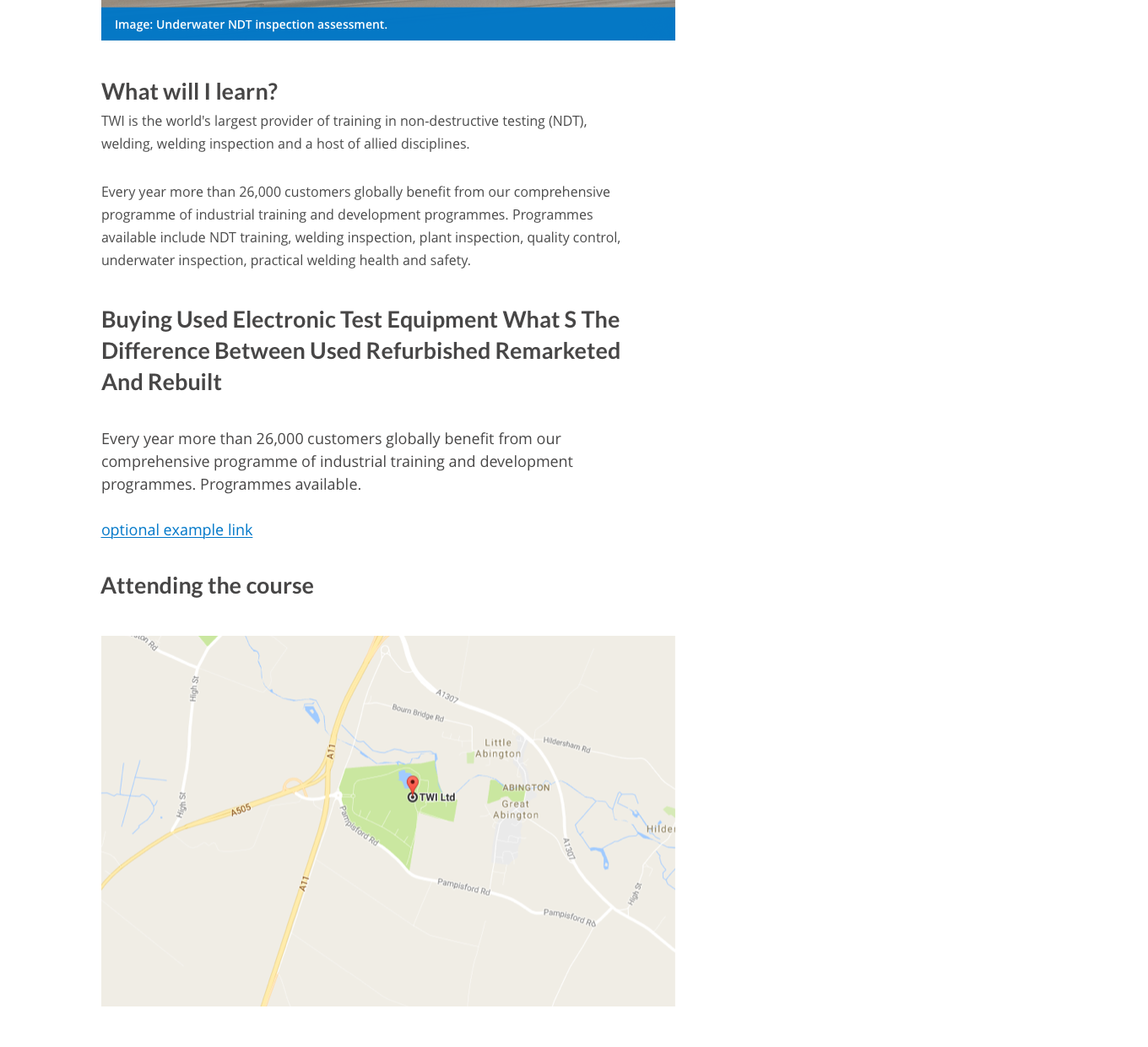
- Define and validate user journeys
- Design and built-out templates for handover
Method
Planning the content, structure and design is extremely important to the success of any website. Studio 24 hosted a series of client workshops to clarify the key business requirements and user goals.
The clear aim was to improve the user journey and navigation, so we looked at user stories i.e. what do different users want and how do they access that information? From the user stories we designed proof of concept user experience (UX) wireframes to cover key user paths.
Wireframes helped us to clearly communicate the proposed website structure to the client. They also enabled us to validate the user journeys and quickly test user interaction prior to progressing onto full designs and development.
Results
Our creative team delivered the HTML designs to TWI which were then implemented by the TWI in-house team.


